Converse & altr
From new ways to browse and find the right shoes and apparel to more frictionless check-out flows, altr and Converse work together to make their site work better for their brand, for business, and for their consumers. With a global audience of trend-setters and sneaker passionate individuals, any UX change on Converse.com can have an immediate business impact. That’s a responsibility our team takes seriously and we’re proud to say, our collaboration with Converse has realized some serious results.
Learn & Plan
As with all of our projects, our work with Converse always starts with a collaborative opportunity assessment to identify and prioritize ways to optimize the Converse.com experience. This process involves deep dives into site and visitor data, previous test and learn experiences, and exhaustive competitive research all considered in light of the company’s business and brand objectives. Rapid prototyping helps to guide decision-making and defines the path forward for concepting, testing, design, and delivery.

Experience Brief

Collaborative Work Sessions

Competitive Analysis

User Experience Design

Visual Design

Responsive Web Design

User Journey Mapping

E-Commerce Design

Prototyping

Figma Style Guide

UX/UI Audits

User Research
Concept & Test
All of our collaborations with Converse are directed by product and business needs, informed by consumer data and UX best practices, and tested through the companies’ rigorous test and learn processes. At each step along the way, altr team members work closely with Converse’s digital customer experience team as well as a global team of key stakeholders in product, merchandising, content, testing and design to ensure all of our work aligns with the company’s priorities and builds upon its existing institutional knowledge and expertise.
Design & Deliver
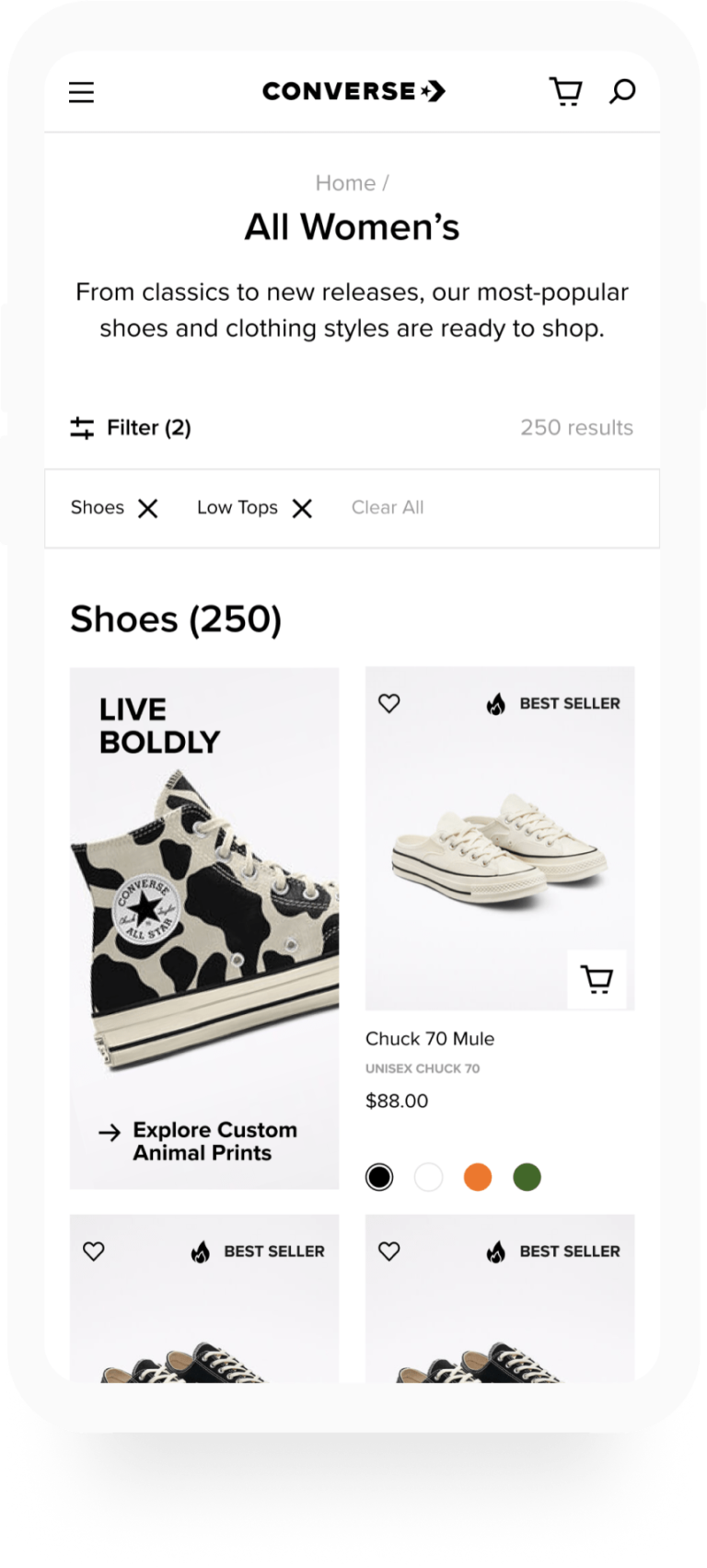
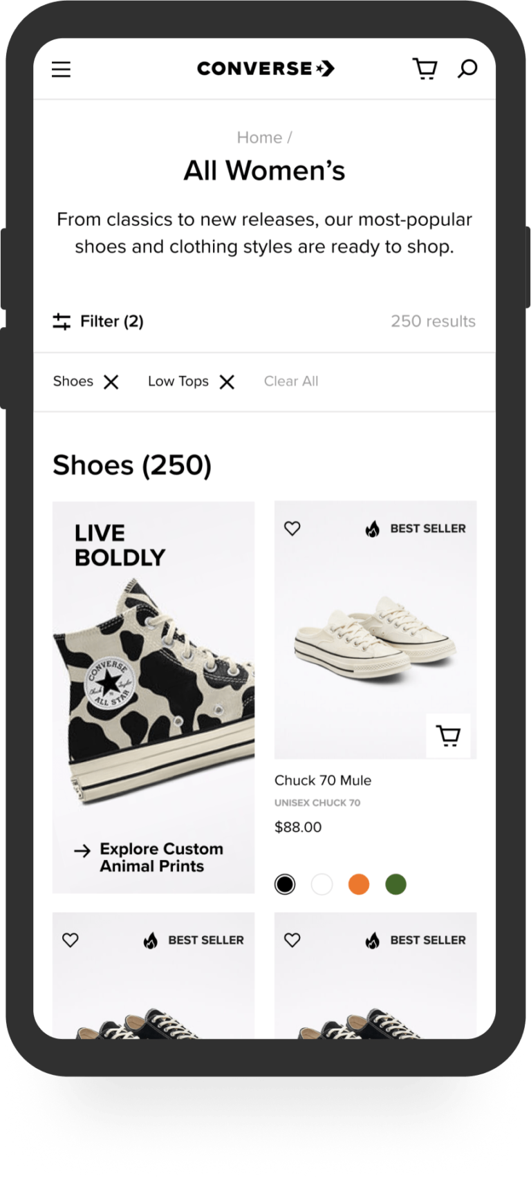
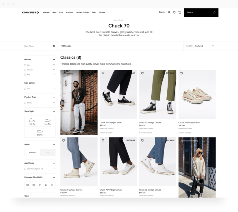
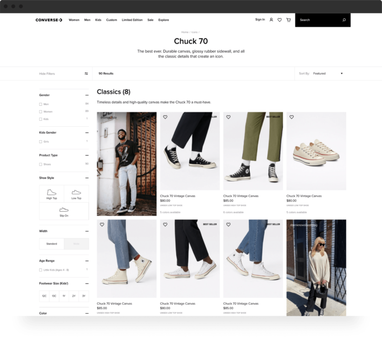
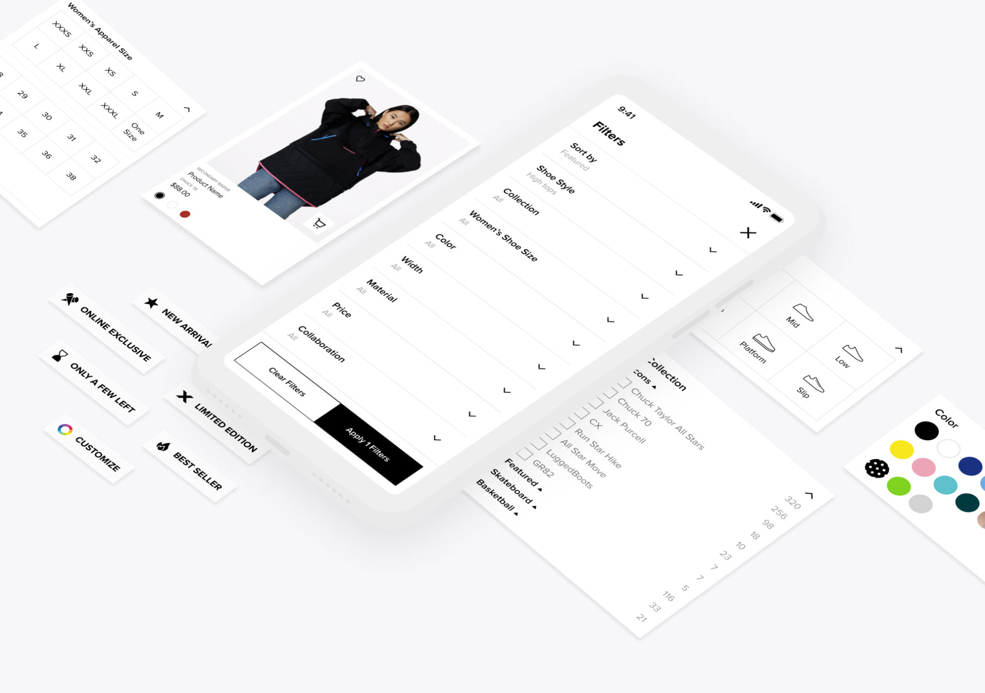
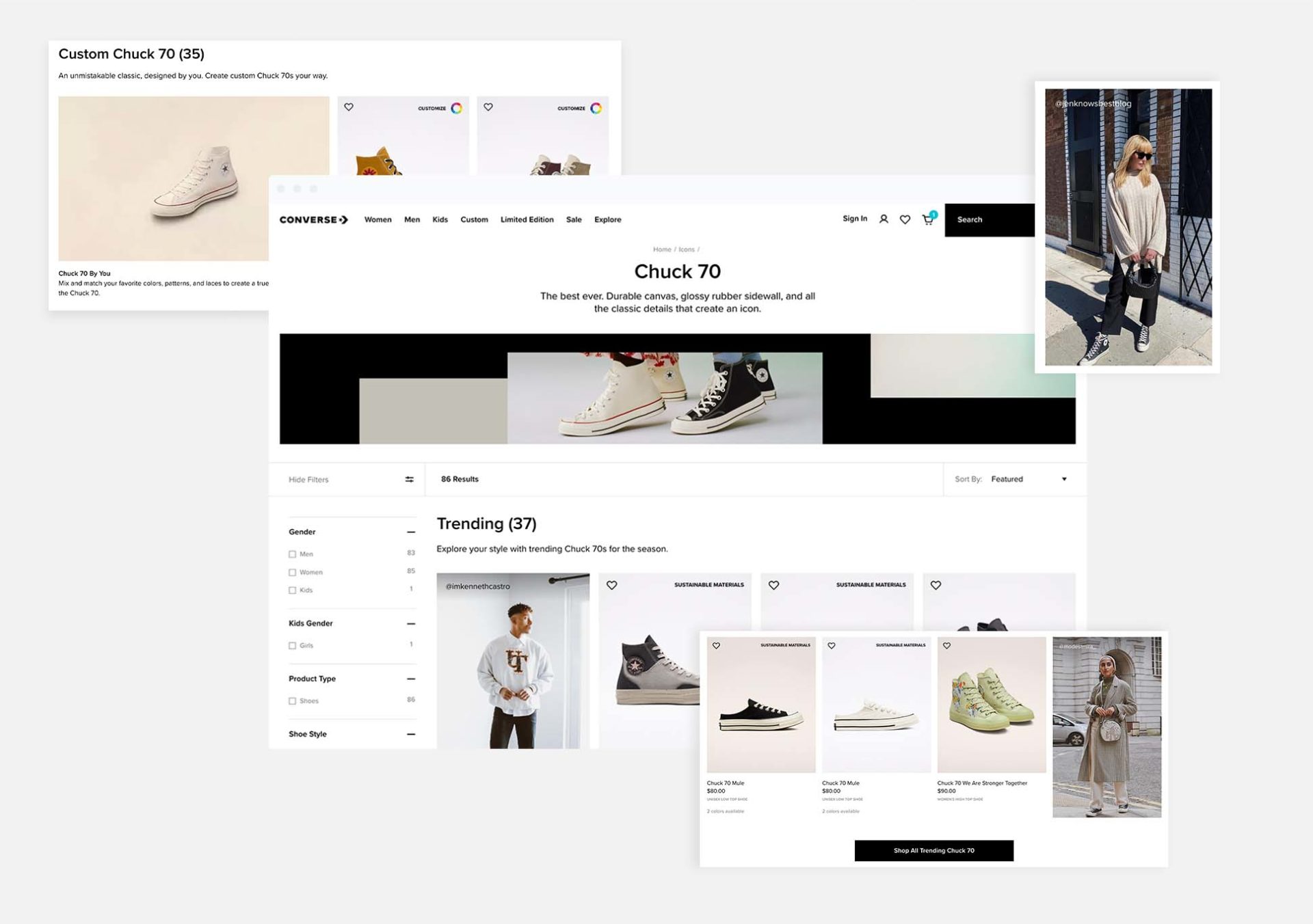
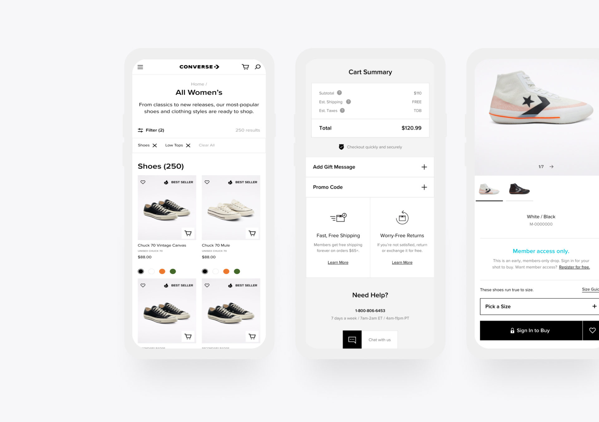
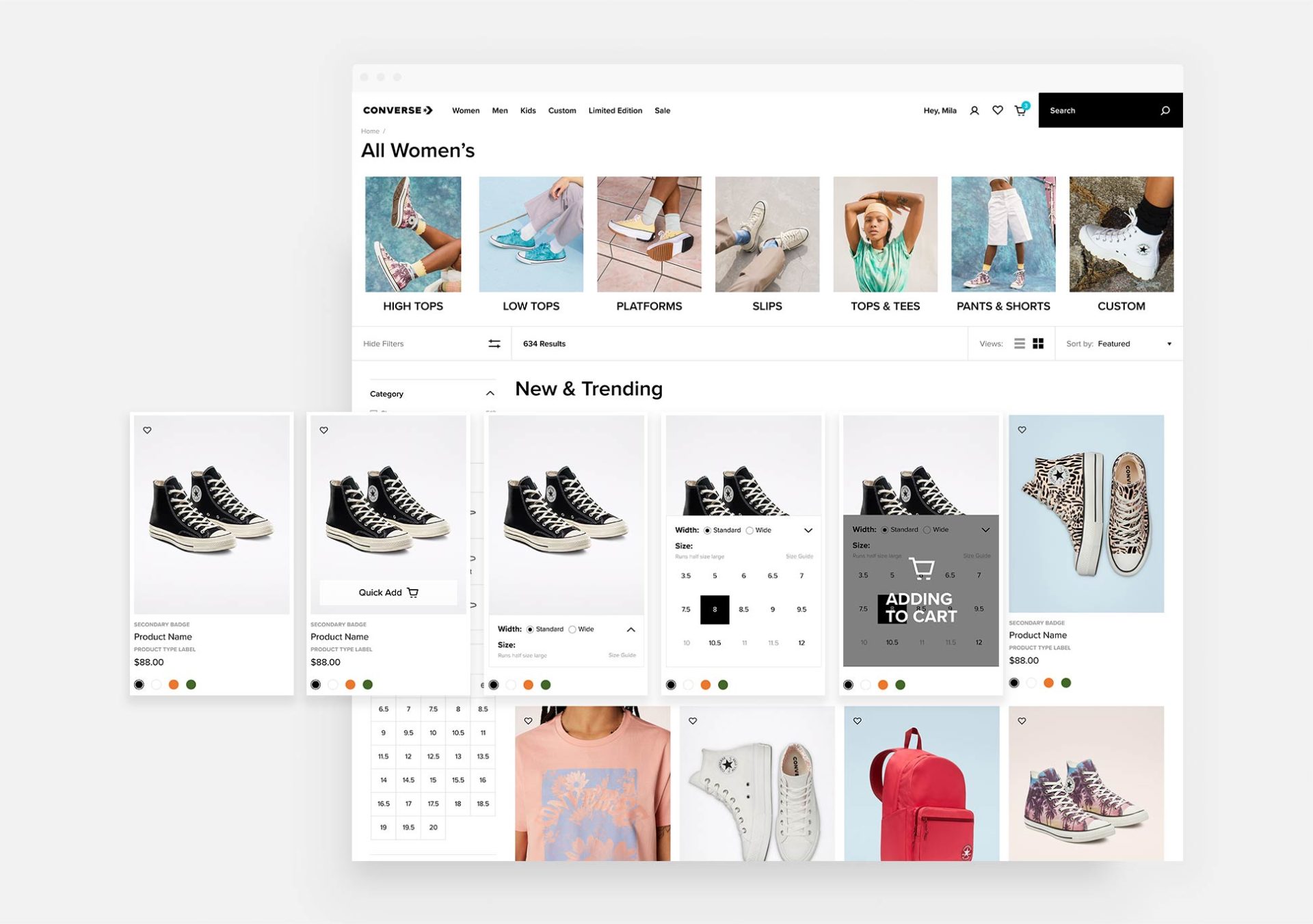
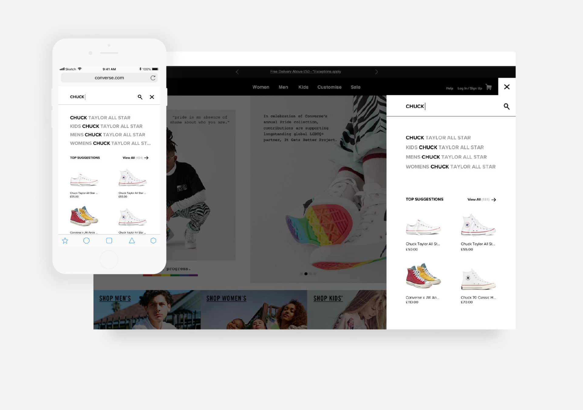
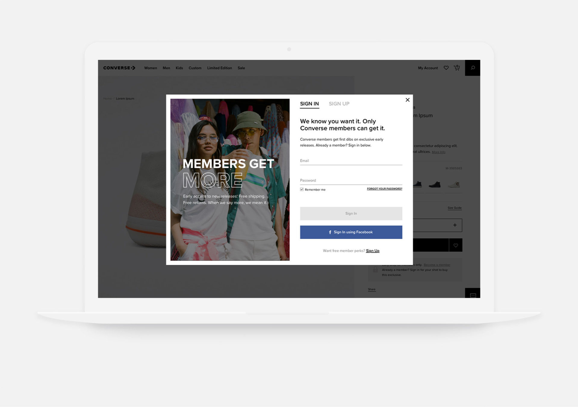
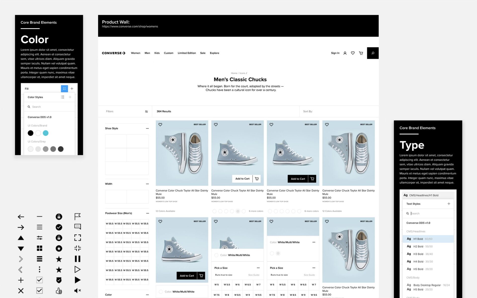
Through our partnership altr has delivered design solutions for optimizing the check-out experience, for a more flexible and brand-proving display of shoes and apparel on the site’s product wall, for new ways to feature new and limited edition products, for a more useful search experience, and for new ways to engage and enroll customers as Converse members.
Operationalizing Awesomeness
Our partnership helps enable the global digital design team with streamlined processes, tools, and guides.
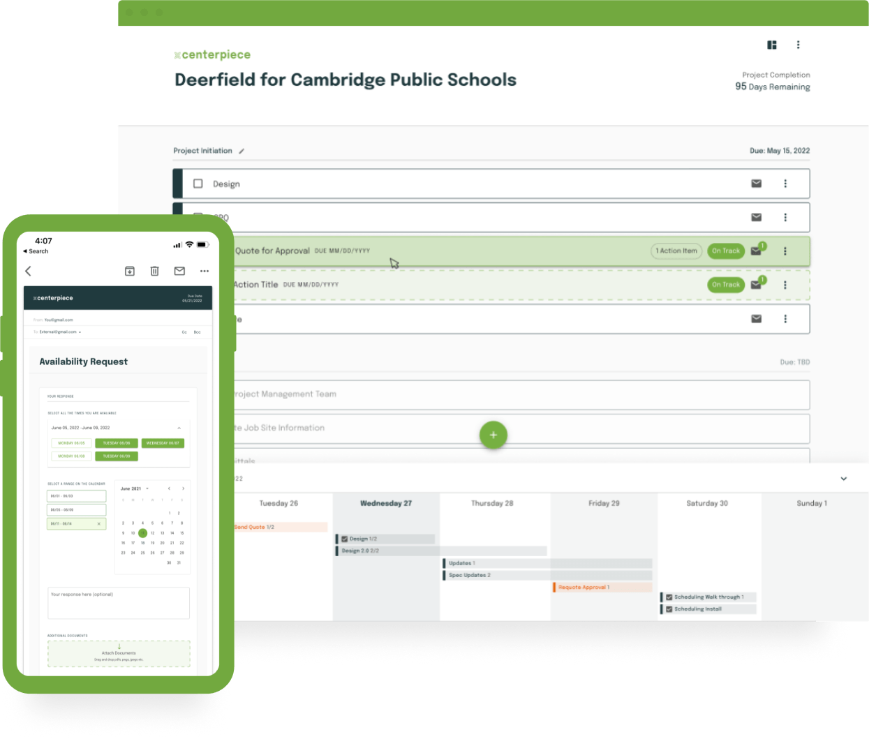
Because coordination gets the job done.
Centerpiece
Because if it’s here, it’s got to be good.
Erewhon Market
