Research & Plan
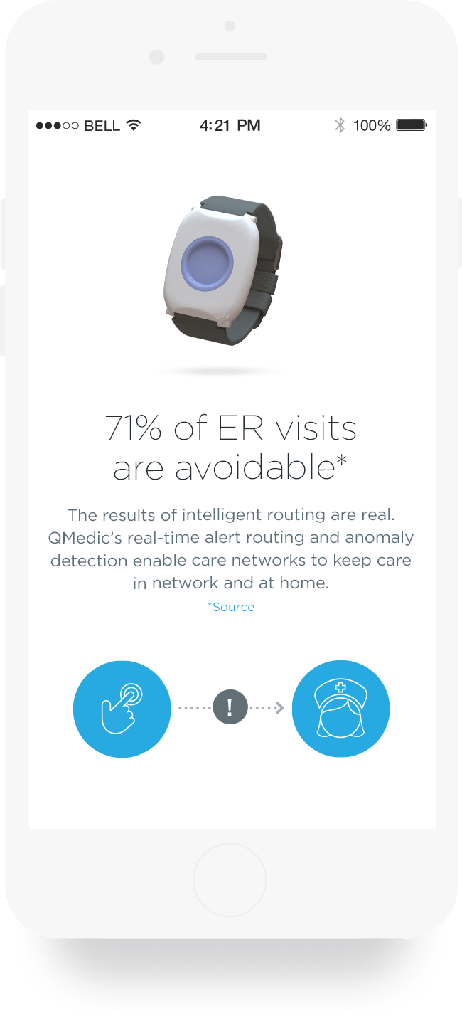
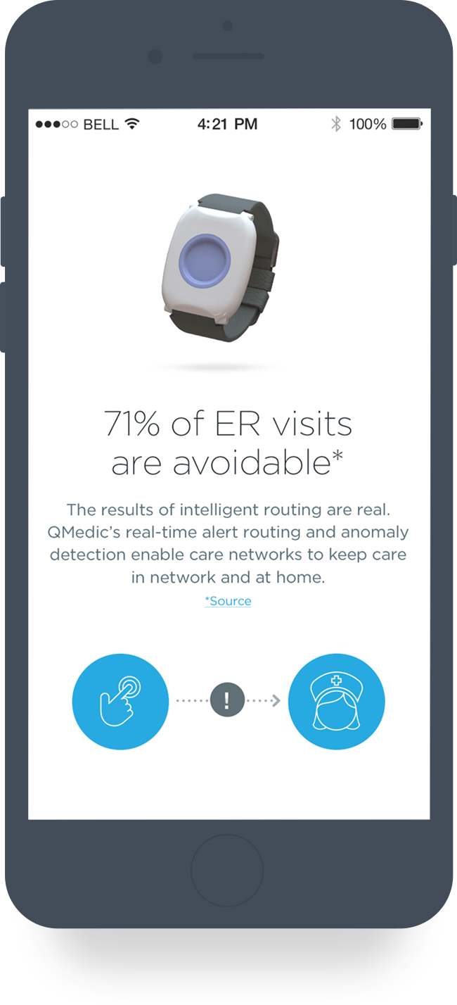
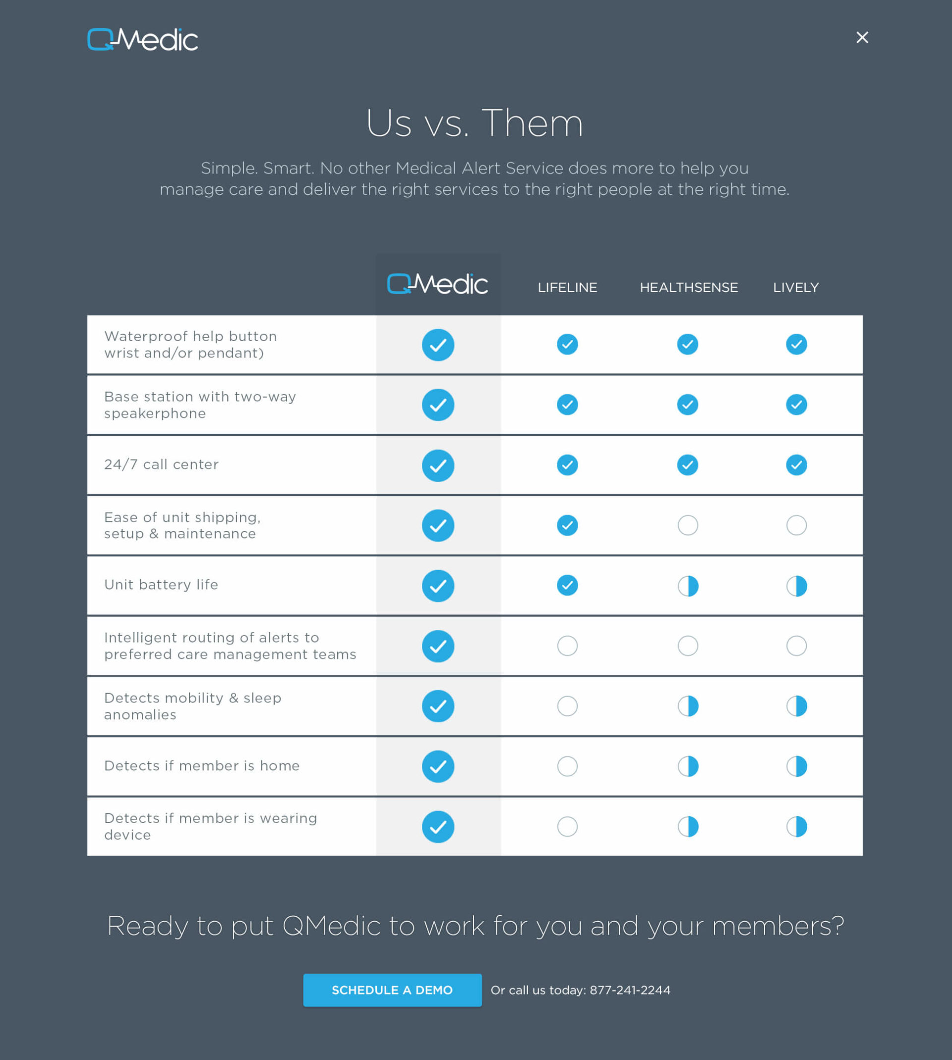
We all remember the old days of personal emergency response monitoring: LifeAlert’s “I’ve fallen and I can’t get up” ads that promised help at the touch of a button. QMedic has built upon the old emergency button, making a good idea revolutionary by connecting it to an always on, 24/7 intelligent routing platform that delivers the right service to the right people at the right time. But the consumer market for these products was crowded and breaking through, even with a breakthrough product, was going to be tough.

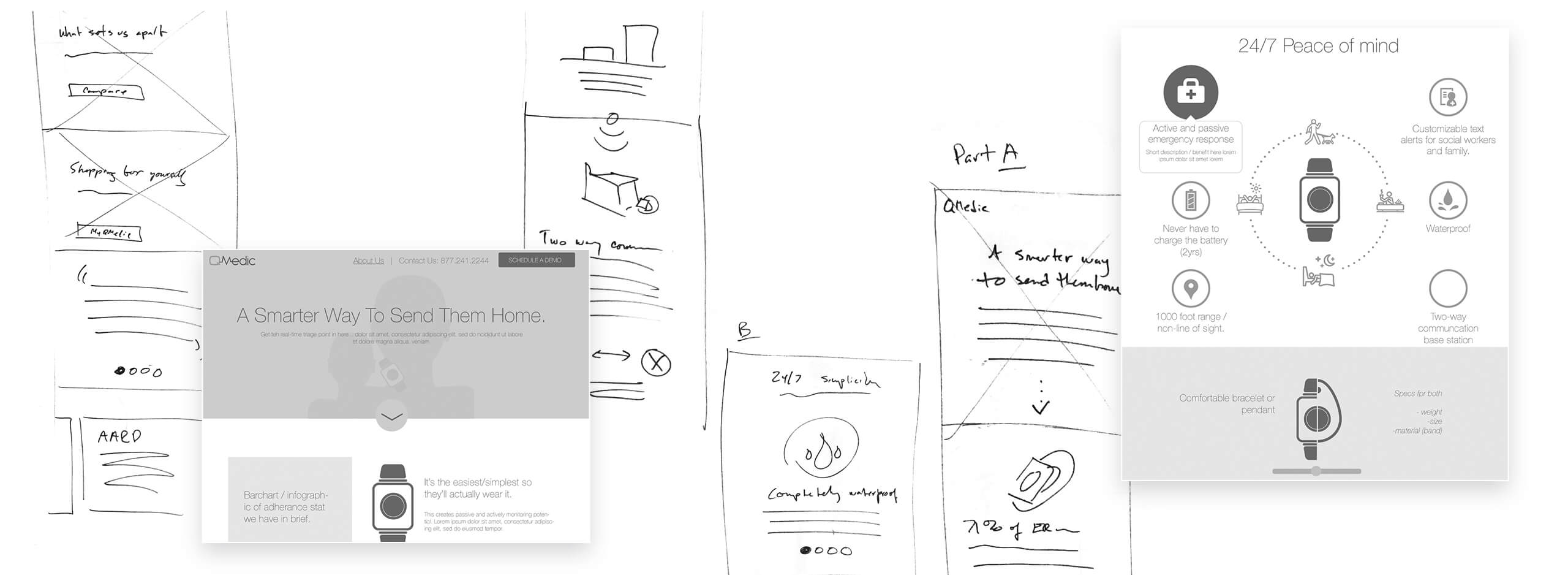
Competitive analysis

Experience brief

Market research

Messaging

Visual design

Brand development

Style guide development

Collaborative work sessions
Concept & Test
Working with QMedic’s leadership, investors and advisors, we recognized that the value of the service’s 24-hour monitoring and flexible response platform to care management plans could help QMedic mitigate the cost of competing in a crowded consumer market. This shift drove a complete rethink of the company’s messaging and the purpose of the site we were building for them.
Design & Deliver
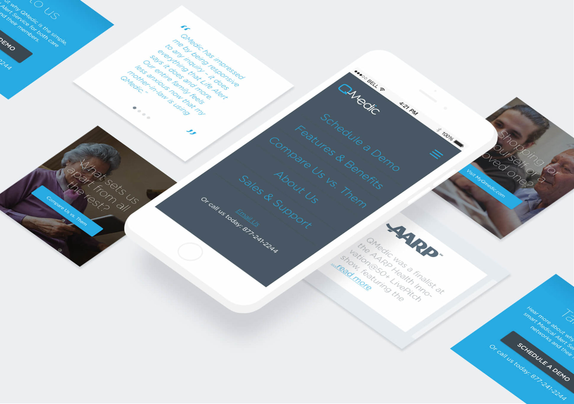
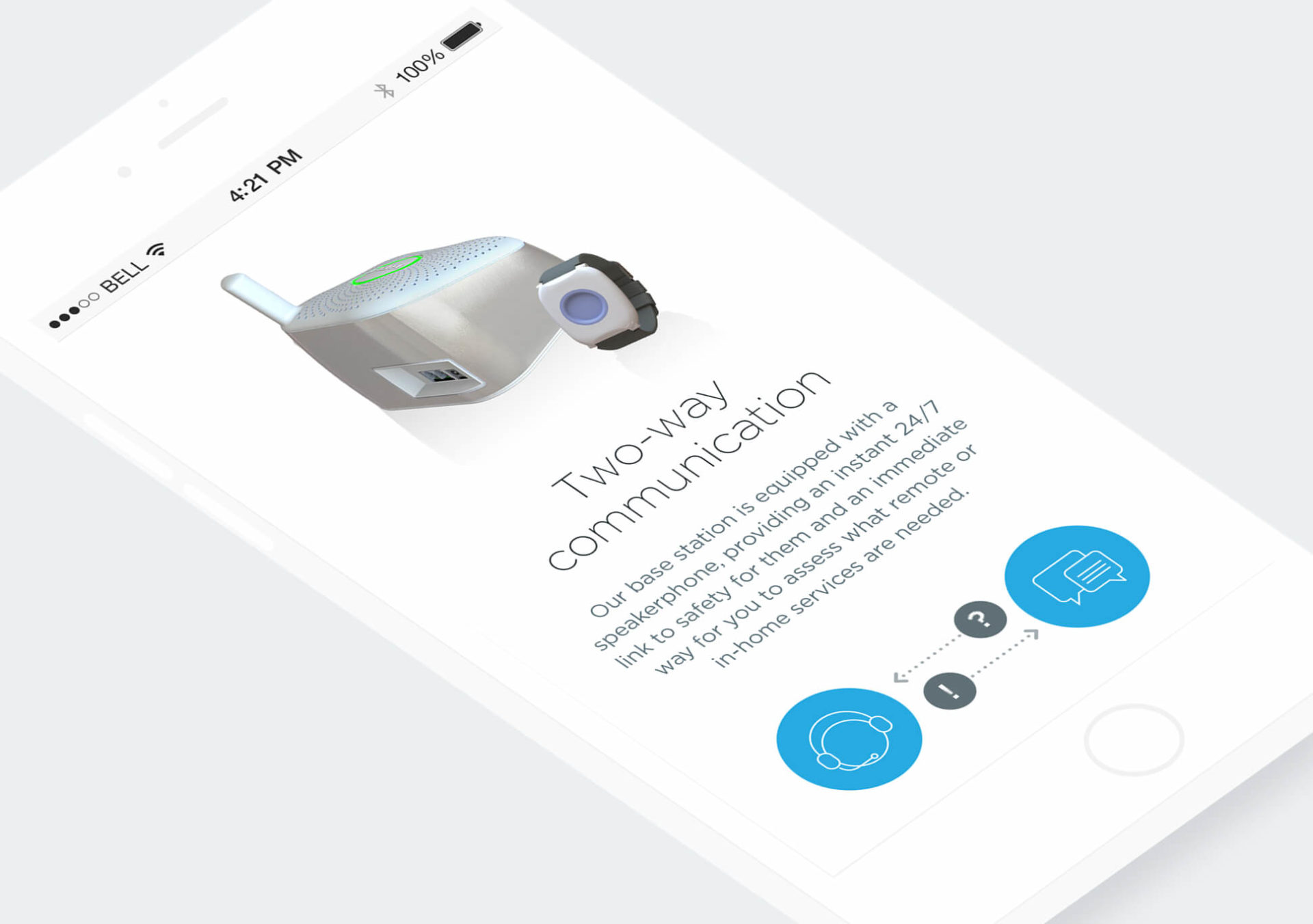
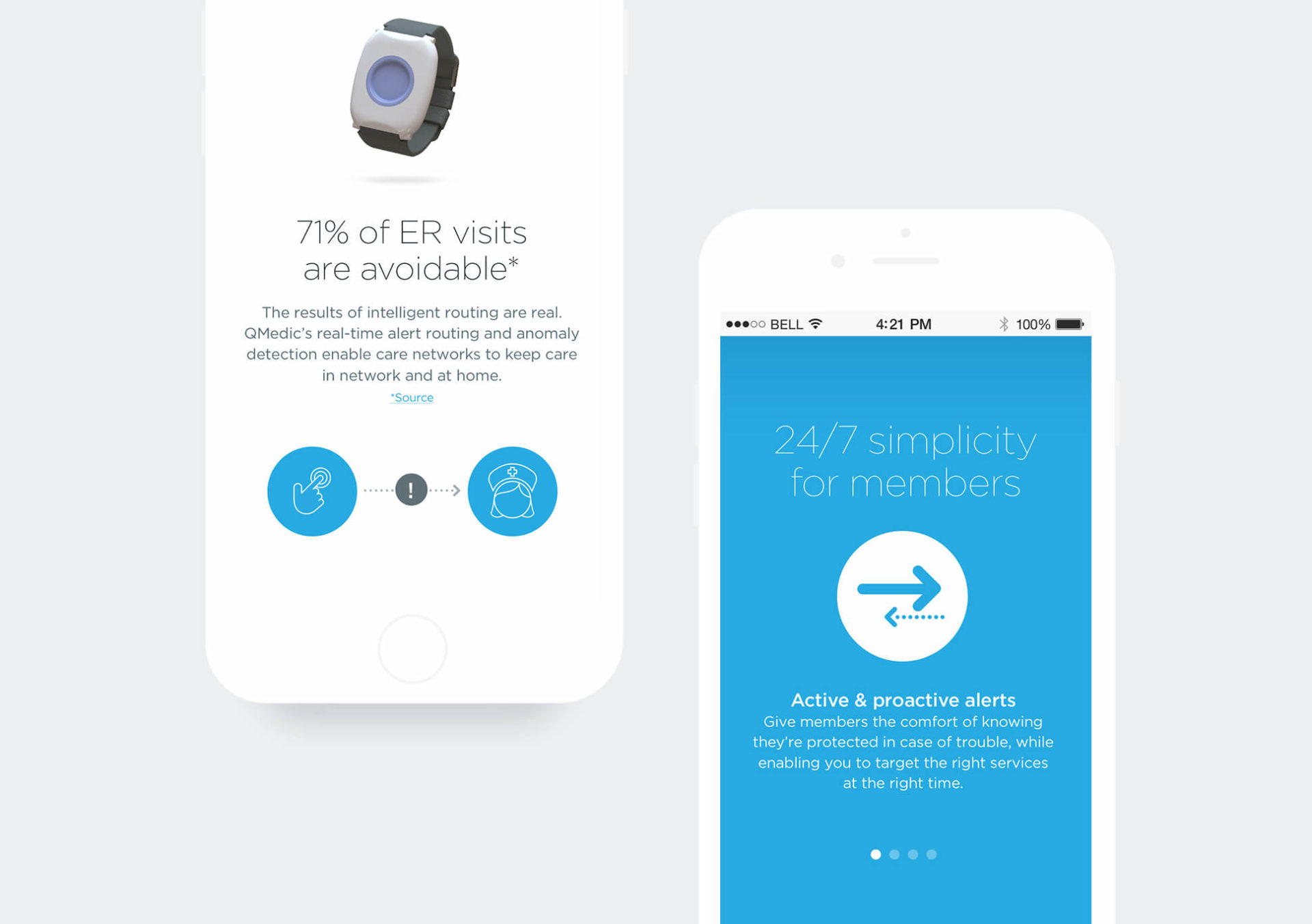
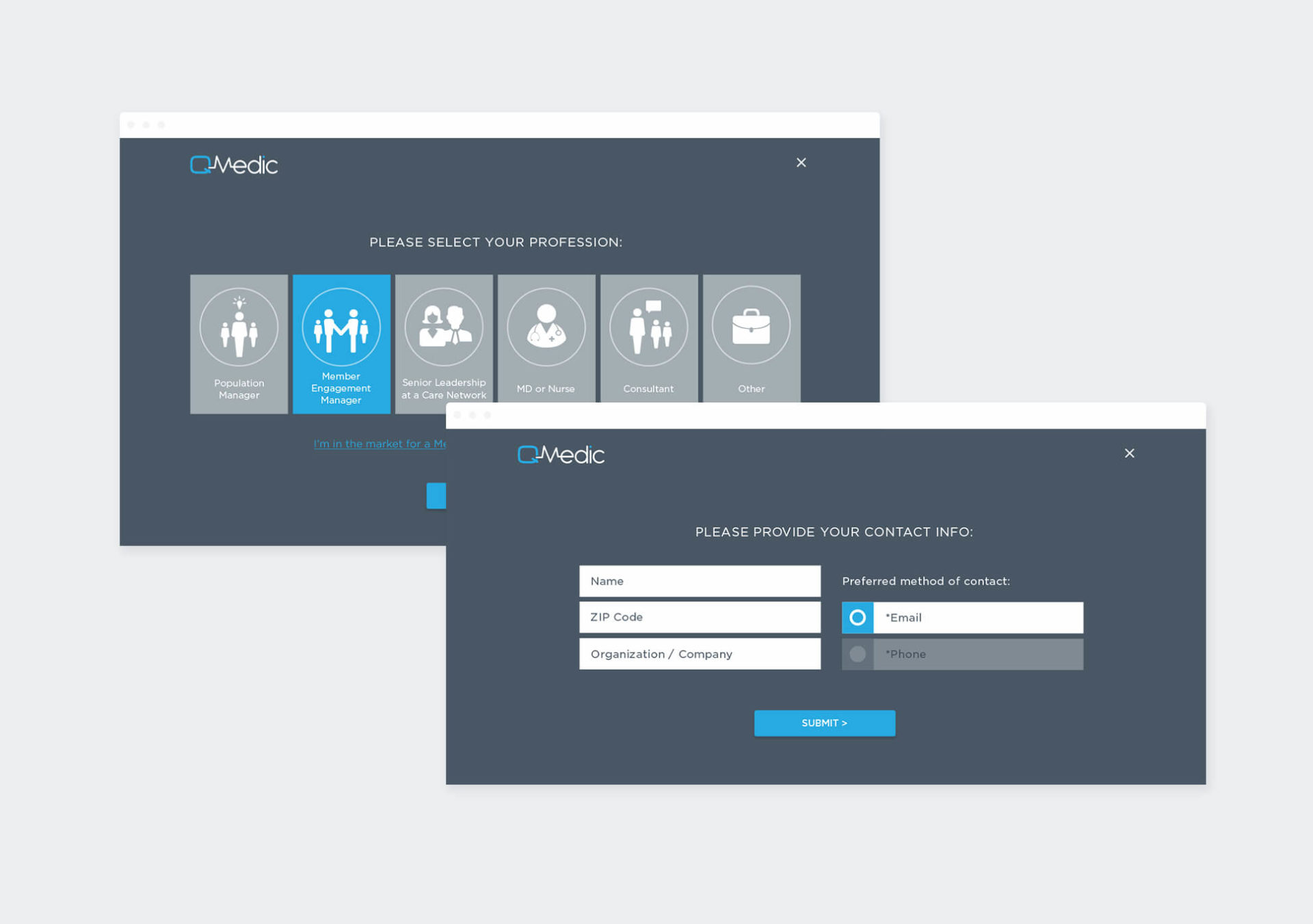
The new QMedic site, now primarily focused on prospective B2B customers, was designed to show how better connections and deeper intelligence are leading to better, more efficient and cost-effective care for people living independently at home. The site serves as a foundation for QMedic’s evolved business model, supporting the company’s growth in serving care management providers.
Their ability to listen to clients and really understand the challenge at hand is outstanding.
Sombit Mishra, CEO

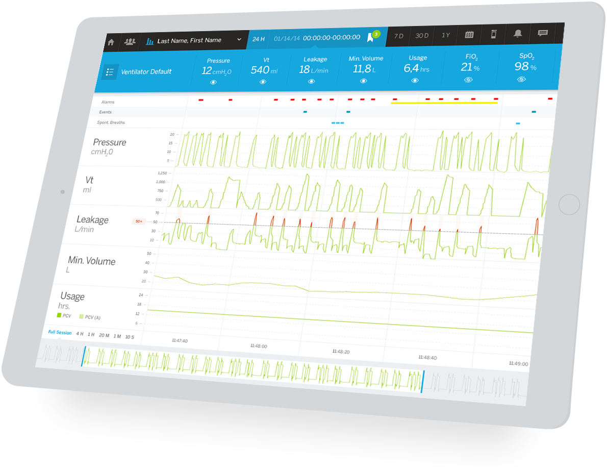
Because connected teams save lives.
HDM-Breas Clinical
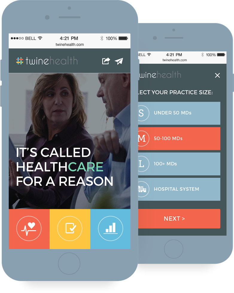
Because healthcare should be about care.
Twine Health
